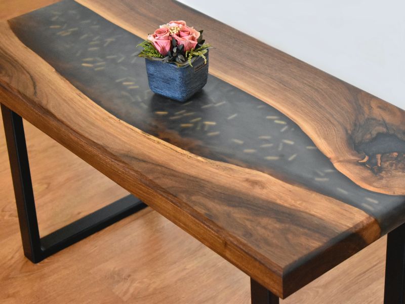
Logo Design

With the power of the Web, and more eyes watching than ever, it’s important for a business to communicate its unique message clearly. The easiest way to recognize a company and distinguish it from others is by its logo.

A professional business should look professional. New business owners often invest a lot of time and money in property and equipment, but do not often match it by investing suitably in their logo.

Here are the most common reasons why many logos look amateurish:

  • The business owner wanted to save money by designing the logo quickly themselves.
  • A friend or relative who claims to know a little about graphic design does it as a favor.
  • The wrong people are commissioned. (Local printers are not likely proficient in logo design.)
  • The business outsourced the job via one of several design competition websites, which are mostly populated by amateur designers.
  • The job was given to an online company that offers really cheap logos.

All of the above can result in disastrous outcomes. If your logo looks amateurish, then so will your business.

Here are the advantages of hiring an established and professional logo designer:

  • Your logo will be unique and memorable.
  • You won’t run into any problems down the line with reproducing it.
  • Your logo will have a longer lifespan and won’t need to be redesigned in a couple of years.
  • Your logo will look professional.

The main advantages of vector graphics for logo design are:

  • The logo can be scaled to any size without losing quality.
  • Editing the logo later on is much easier.
  • It can be adapted to other media more easily than a raster image.

When printed in small sizes, a complex design will lose detail and in some cases will look like a smudge or, worse, a mistake. The more detail a logo has, the more information the viewer has to process. A logo should be memorable, and one of the best ways to make it memorable is to keep things simple. Look at the corporate identities of Nike, McDonald’s and Apple. Each company has a very simple icon that can easily be reproduced at any size.

It is a very common mistake. Some designers cannot wait to add color to a design, and some rely on it completely. Choosing color should be your last decision, so starting your work in black and white is best.

Every business owner will need to display their logo in only one color at one time or another, so the designer should test to see whether this would affect the logo’s identity. If you use color to help distinguish certain elements in the design, then the logo will look completely different in one tone.

When it comes to executing a logo, choosing the right font is the most important decision a designer can make.

  • Using a maximum of two fonts of different weights is standard practice. Restricting the number of fonts to this number greatly improves the legibility of a logo design and improves brand recognition.

This is the biggest logo design mistake of all and, unfortunately, is becoming more and more common. As mentioned, the purpose of a logo is to represent a business. If it looks the same as someone else’s, it has failed in that regard. Copying others does no one any favors, neither the client nor the designer.

error: Content is protected !!
Call Now Button